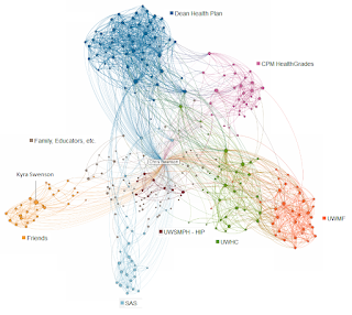
A few months ago, I was thinking about my professional network and wondered what it would look like if it were mapped out. It turns out, LinkedIn has a lab project to do just that. I loaded up my profile and a few minutes later, this came out (click for larger version):
Each dot in the above chart represents a person, and each line represents a connection between people. The larger the dot, the closer the relationship. I am at the center, and unique clusters of people become apparent by their interrelationships, and they are grouped together in space.
The lab does not label the clusters, but it does identify the clusters by color, and it allows the user to identify those clusters and name them, as I have done above. Further, you can explore your network by hovering over the individual dots that represent people.
Essentially, five groups arise from my network: Family, Friends, and Educators on the left; Dean Health Plan at the top; CPM Healthgrades at the upper right; the UW Health System, which is composed of the University of Wisconsin Medical Foundation (UWMF), the University of Wisconsin Hospitals and Clinics (UWHC), and the University of Wisconsin School of Medicine and Public Health (UWSMPH); and finally the SAS Institute at the bottom.
The lab isn't perfectly accurate, but it is pretty good. I checked out a number of individuals and some don't make sense, but most do. As an example, my wife is one of the larger dots on the left, which makes sense, since she also has networked with our friends and family on LinkedIn (although I usually avoid doing so for a number of reasons).
The UW Health cluster is visually split, but there is apparent movement and interrelationship between the organizations. There are some people who traveled between the UW and Dean, one way or another. The same is true between Dean and CPM, with most, I believe coming from Dean to CPM. There are some hubs in each organization, likely managers, project managers, or other people who attended a lot of meetings (I think one of the big dots at Dean was an IT manager who sat in on a lot of projects).
Aside from family and friends, SAS is probably the oddest group. I have some connections, and they seem to be somewhat strong. Before I attended the SAS Global Forum, this chart may have looked quite different, since I made many more connections after the conference. The chart also shows how well-developed my connections were at Dean and the UW, and how I'm still fairly new at CPM. (I bet if I ran this today it would look a bit better developed.)
Of course, charts like these leave out people who aren't on such sites as LinkedIn, but I would think that all the other people would compensate for them when graphed like this. Additionally, I don't have much of a network for old jobs like the ones I had in college, nor have I really networked much with fellow college classmates.
It would be interesting to see what other people's networks look like, especially people who are essentially professional networkers, like HR professionals or recruiters. How do networks in different industries look (mine is mostly health care)? What if you have someone who only networks with family or friends? What does that show? Perhaps different geographic locations you've lived in? How about someone who is a world traveler?
This type of graph is very powerful in that makes you think about the data behind it and ask such questions as I have done. It opens up doors we haven't thought of and inspires curiosity.
